With the rapid pace of technological change, comes no shortage of issues for website owners.
As mobile phones have become increasingly advanced, mobile internet use has grown accordingly. In fact, the rate at which mobile users is growing is actually quite staggering.
Additionally, Google recently started moving some sites over to its long-awaited mobile-first index.
So now, more than ever before, it’s pretty much a requirement that websites be optimized for mobile (mobile-responsive).
The benefits are nothing to shake a stick at.
- Improved search visibility
- Better user experience
- More conversions
That’s right, mobile optimization can absolutely impact your SEO and sales. The verdict has been in for a while in fact.
All the way back in 2015, Google rolled out their “Mobilegeddon” update that aimed to deprecate non-mobile-friendly websites from mobile search.
While the effects weren’t as damaging as many feared, it’s nevertheless clear that it had an impact.
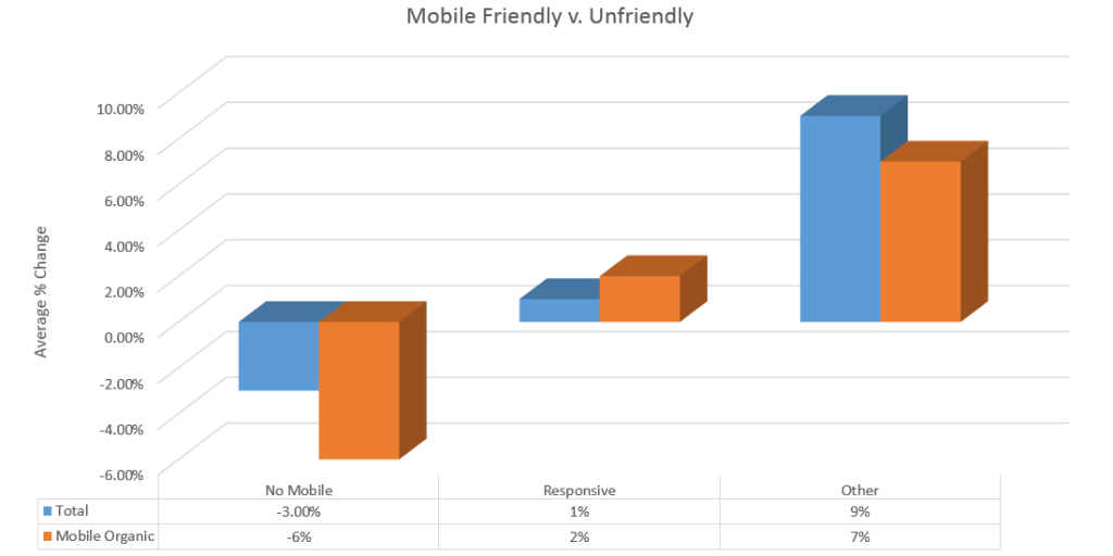
Image source: Lunametrics
If you want to see the data, check out these case-studies by Lunametrics and Scorchsoft. They clearly illuminate the effects going mobile-friendly can have on your SEO and organic traffic.
So it’s clear that being mobile optimized matters. But what exactly does it mean, and how can you reach the goal line?
Let’s dig in.
What Is Mobile Optimization?
Of course, you probably get the gist of it.
At the most basic level, all being mobile optimized means is that your website is intuitive for users to engage with on a mobile a device.
But more specifically, you might be left wondering what to watch out for.
There are of course, obvious infractions. These might include things like a horizontal scroll bar, or misformatted imagery and spacing.
But there are also less obvious errors that might include hover-over tooltips or features that are lacking on mobile devices, etc.
So in order to get optimized, you’ll primarily want to focus on ensuring your content is easily accessible to users on both desktops and mobile devices.
Before we go and fix anything though, let’s find out if it’s even broken in the first place.
The Easy Way to Test for Mobile Optimization
Since Google is invested in making the web more user-friendly, they’ve gone ahead and built an all-inclusive free tool to test for mobile responsiveness.
Simply use their Google Mobile-Friendly Test to quickly determine if your website has a mobile-friendly version in action.
It’s not foolproof, but it’s a good starting point.
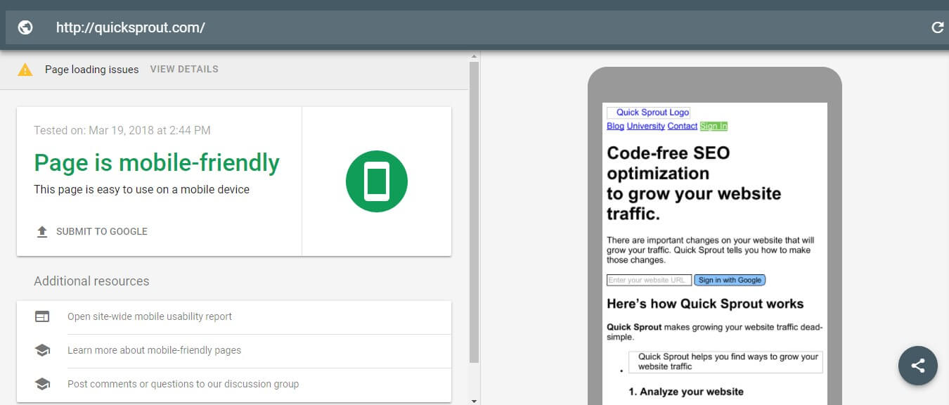
As you can see in the above example, it’s possible that Google will sometimes determine that a page is mobile-friendly, but at the same-time show a broken example on the right side of the screen.
Don’t get too hung up on it.
If it’s saying that your page is mobile-friendly, you’re likely in the clear. But it makes sense for you to test it out on your own mobile device just to be safe.
Also, remember that if you very recently made mobile-responsive changes, it can take a little time for Google to recrawl certain websites. So if you want to be on the safe side, click “Submit to Google” after your changes manage to obtain the “page is mobile-friendly” approval.
Another tool that you might find useful is LambdaTest. You can leverage their platform to test your website on a variety of different devices, browsers, and screen sizes. All from within your own browser.
We use LambdaTest regularly and definitely recommend it as a more in-depth way to test websites for mobile-friendliness.
Remember, mobile-responsiveness is simply one part of the mobile optimization puzzle.
It’s also worth looking at your page speed on mobile devices to determine if your website is truly mobile optimized.
Google PageSpeed Insights is a powerful (and free) tool that scores how fast or slow your website loads on desktop and mobile.
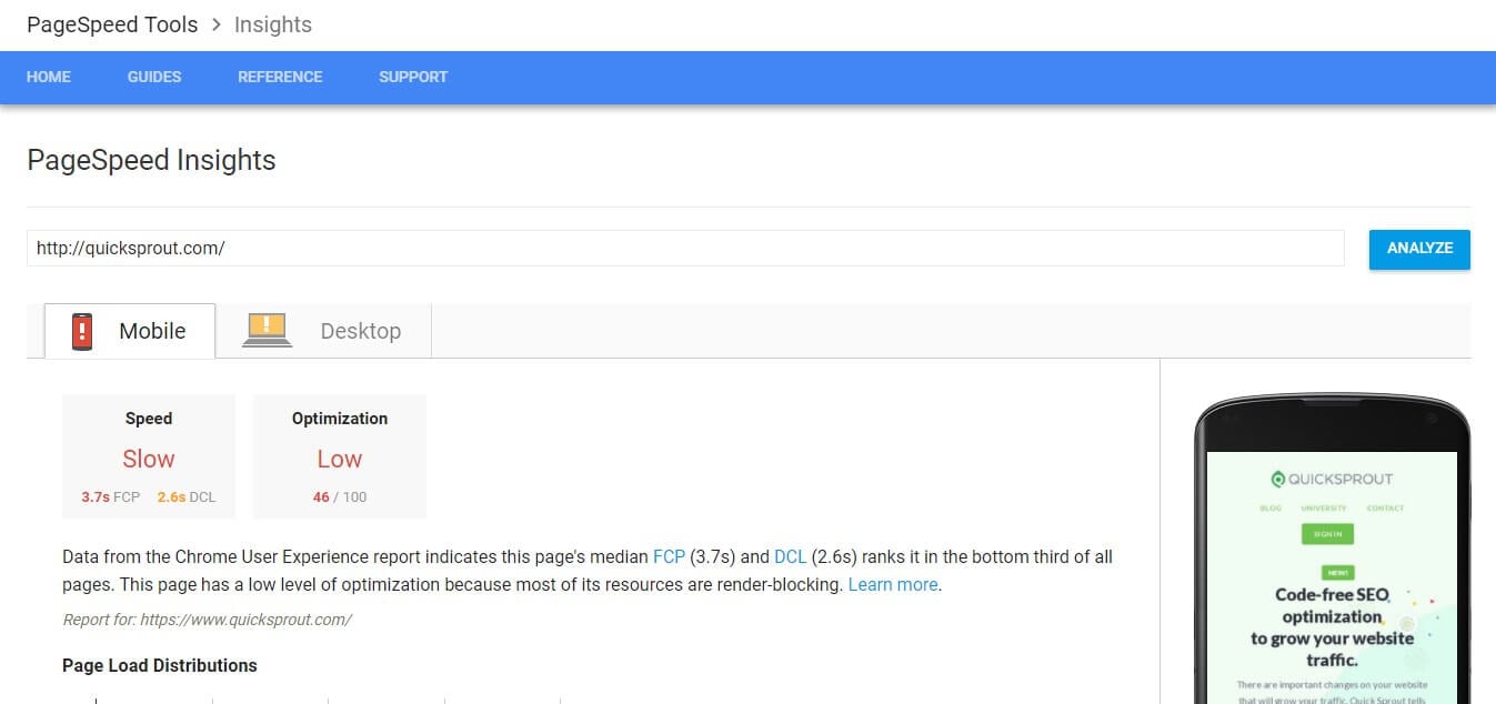
More specifically, it will identify problem areas so you or your developer can easily take action to improve load times.
Decide How to Serve Mobile Content
So we’ve covered how to determine if your site is mobile optimized or not, and we touched on why it’s important.
Now we need to get to the meat of the article. How to get mobile optimized.
There’s a lot to cover here. First and foremost, you’ll need to decide how you want to display your website for mobile users.
There are three ways you can do this. Each with varying degrees of difficulty and development time required.
- Mobile responsive design
- Dynamically serving content
- Redirecting to a dedicated mobile URL
Let’s take a closer look at each.
1. Responsive website design
First and foremost, it’s worth noting that while Google supports all three, they prefer this method.
Thus, implementing a responsive design is one of the best ways to optimize your site for mobile users.
As we covered earlier, responsive design essentially means that your site’s layout will adapt to a multitude of resolutions.

This in turn enables users to easily navigate your website regardless of the device they’re using to access it.
Now, lucky for you non-developers out there, most CMS platforms offer free responsive themes that are easy to download and install.
Website builders like Weebly, Wix and Squarespace are mobile-responsive by default. And WordPress has tons of responsive options in their theme directory.
These are accessible from your WP dashboard, and don’t necessarily require any coding knowledge.
For custom websites however, you’ll likely need to reach out to your web designer/developer in order to implement responsive design.
If you’re feeling adventurous however, you can try your hand at it of course. Maybe start out with this short tutorial on 1st Web Designer.com.
2. Serve dynamic content
If you don’t want to (or can’t afford to) invest in responsive design, you could alternatively consider serving dynamic content.
This is done by detecting the type of device being used by any website visitor, and serving a different set of HTML and CSS depending on what comes back.
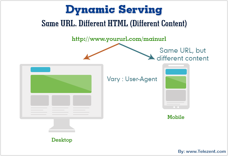
There are a few circumstances in which this might be effective, but generally it’s more trouble than it’s worth. For starters, you’ll need to keep a constantly updated/curated list of user-agents, which can be quite the hassle.
Additionally it’s not unheard of for users on either desktop or mobile to be served the wrong version accidentally. This would obviously result in a poor user experience.
But if this is the right approach for you, here’s a deep-dive on the VaryHTTP header, which is the method you’d want to employ.
3. Dedicated mobile URL
The third and final way for you to consider serving mobile content, would be to set up a second site/page for mobile users.
This would circumvent the need to customize responsive code, but requires that you be very careful and thorough with your 301 redirects.
If you decide to make an entire parallel site experience for mobile users, be sure to include a rel-canonical tag, and clearly delineate between the two in terms of URL structure. Many site owners taking this approach will create an “m” subdomain.
Remember, this method is as equally problematic as serving dynamic content. If you choose route, be sure to make it easy for users to “choose” the alternate version of the site, in case they’re served the incorrect one.
Additional Mobile Optimizations to Consider
While the last step likely required your developers and designers to be involved, the following optimizations may be possible without technical expertise.
Of course, it would be wise to have a web designer and developer on hand regardless.
Design for mobile
This may sound the same, but actually differs from using responsive-design principles.
What we mean by design for mobile is this… for the mobile version of your content and landing pages, make sure that you consider a few key points.
Mobile users have to touch the screen with their fingers, which are sometimes quite large in proportion to on-page elements.
So try to make sure that it’s difficult for users to “fat-finger” page elements. Enlarge buttons, remove hover-effects, etc.

Image Credit: TNW
Also, remember that the vast majority of mobile devices won’t support Flash. So avoid Flash at all costs. Just use HTML5 or CSS for any animations you want to add to pages.
Last but not least, make sure that your site navigation makes sense with only a hamburger menu icon at the top.
Since there isn’t nearly as much screen real-estate to work with on mobile devices, you won’t have all of those handy header links clearly visible like you would on desktop.
So try to ensure that your site structure makes sense for users accessing it via mobile phones and tablets.
Improve your site speed
Site speed and mobile-optimization go hand in hand.
Luckily, if you’ve employed mobile-responsive design, you’ve already got a leg up on this one.
In general, the mobile version of websites will usually require fewer resources than their desktop counterparts. But that doesn’t mean you’re out of the woods.
Your first course of action, is to run a site speed test (like we described above), and take a look at your mobile load times.
The next item on your to-do list, will be to prioritize the tips provided, and get to work.
Typical factors to consider are:
- Image compression and optimization
- Leveraging caching tools
- Lazy load images and comments
- Reducing redirects
To get a full walk-through on how to improve site speed, you can check out our guide on the subject here.
Additionally, if you’re on WordPress, we also compiled a list of the best WordPress plugins to help improve your load times.
If you’re not on WordPress, don’t panic. Just take a look at the list, and then search for comparable options that are available for your CMS.
Remove interstitials for mobile visitors
No one likes full-screen interstitial ads. But, they’re still part and parcel to online advertising.
So if you’re employing them on your website, we don’t blame you (though we might throw some shade your way).
Google has been very clear however, that they believe interstitials are more egregious to the user experience on mobile devices than on desktop computers. More importantly, these intrusive ads will actually hurt your rankings.
Here’s an article covering the topic in greater detail.
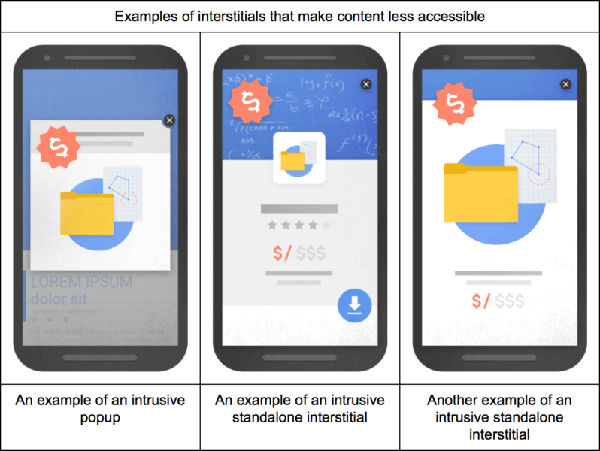
Image Credit: Search Engine Land
And let’s be honest, who can blame Google for taking this stance? If you’ve ever browsed the web on your phone, you likely know why they did.
Often, these interstitials are misformatted. Sometimes the button to close them is missing due to a screen size issue. The list goes on and on.
Even if you’re sure that yours are going to show correctly, it’s best to disable them for mobile visitors entirely.
Wrapping it up
In case you didn’t pick up what we’ve been laying down, the world has gone mobile.
Ignore this fact at your own peril. It’s now a case of “if you can’t beat ‘em, join ‘em.”
So now more than ever before, every website owner should take a good hard look at their mobile optimization.
If you’re going to maintain your rankings and grow traffic, you’ll want to make sure you have a mobile-friendly version for all of your most important landing pages and content.
With any luck, following our advice above will help you get started on the right foot.
This guide is by no means exhaustive, and there are plenty of other angles to consider. But we’re confident that it’s the best place for you to start.
It’s hard work, to be sure. But in exchange, you’ll earn more traffic, lower your bounce-rates, and ultimately improve your conversions.
Frequently Asked Questions
What is mobile optimization?
Mobile optimization is the art (or science if you prefer) of ensuring your website will function correctly and intuitively on mobile devices.
Why is mobile optimization important?
It’s important because these days, it’s extremely common for users to browse websites on their mobile devices. If your site isn’t mobile optimized, users will bounce and you’ll miss out on valuable leads and sales. Further, search engines take mobile optimization into account in their ranking algorithms.
How to do mobile optimization?
There’s no fast and easy way to mobile optimize, but you can start by using a mobile responsive design. Also be sure to speed up load times, consider using accelerated mobile pages (AMP), and design content with mobile-users in mind.


